

The met museum
The met museum
Redesign the museum online store into a responsive website
The objective of this project was to stimulate online business growth by redesigning a museum online shop and making it user-friendly, based on the findings from business analysis and user research.


Problem Statement
As one of the largest museums in the world, the Metropolitan Museum of Art has a significant number of fans everywhere. They tend to purchase items from the museum shop for the quality, while showing their support. However, those who don't live in New York are simply seeking an easy way to shop. They need a website with clean layout and simple navigation to optimize their shopping experience. This would make them return to the online store more frequently.
Solution
My design solution was to restructure the information architecture of the museum shop website, as well as make the design look more consistent with the museum main website.
Note: The style of museum store is quite different from the museum main site
Process

The Met Research Highlights
Research Highlights
The Met Research Highlights
Research Highlights
Business Analysis
Contextual Inquiry
BUSINESS
Best sellers: depends on the store
Popular store: clearance store
Regular customers: museum members
Display: holiday theme
Sort by: subject matter
Average: purchase: $100-$300
CUSTOMER
Age: all ages, majority of older people
Type: tourists, locals, museum members
Why in store: loyalty, quality, display, uniqueness
Why online: don't live in New York, to buy bigger items
Pain points: need recommendation on some items
Competitive and Comparative Analysis
1.Competitive Analysis:
To figure out how we can provide a better shopping experience, we compared the Met online store with other world class museums, in terms of service, user flows, features, categories, navigation and information structure.
2. Comparative Analysis
As the biggest retailer in e-commerce, Amazon is well-known for its prompt checkout process and customized features. Therefore, we decided to learn from that model by comparing the user flow between Amazon and the Met online store.
- Currency: Add a currency options to facilitate international business
- My account: Add recommendation and shopping history in my account to help users make decisions
- Contact: Customer support and my account should be placed in a more prominent place
- Categories: Navigation bar can be re-organized
- Alignment: To have the same brand voice, the style and color scheme of the store should be aligned with the museum main site

The Met User Journey
User Journey Highlights
The Met User Journey
User Journey Highlights
Card Sorting
According to the research we undertook, navigation on the Met online store is one of the areas that can be improved. In order to create stronger information architecture and hierarchy, card sorting is the first thing that should be addressed.
Purpose: Set the priorities based on the user perspective
Method: Open card sorts and Close card sorts
Products: 100 assorted products from the current site
Test: 5 people
- Almost anything can be included in the gift category but it would be good to further sort it by gender, occasion.
Home decor can cover a wide range of products, such as sculpture, posters.
“ I did not think to put statues in home section, unless it is home decor”- Jewelry can be combined with accessories
“ Is watch jewelry or accessories?”
Site Map
Based on the findings from cart sorting and previous researches, the global navigation has been reorganized as shown.
It's worth mentioning that Jewelry & Watch section from the previous navigation bar has been moved to Apparel & Accessories section. Also,Print &Poster and Sculptures have been moved to the Home Decor section which was created to cover more categories. Least but not the last, the Holiday section has been moved to secondary navigation under all the sections. See the proposed site map below.
Persona
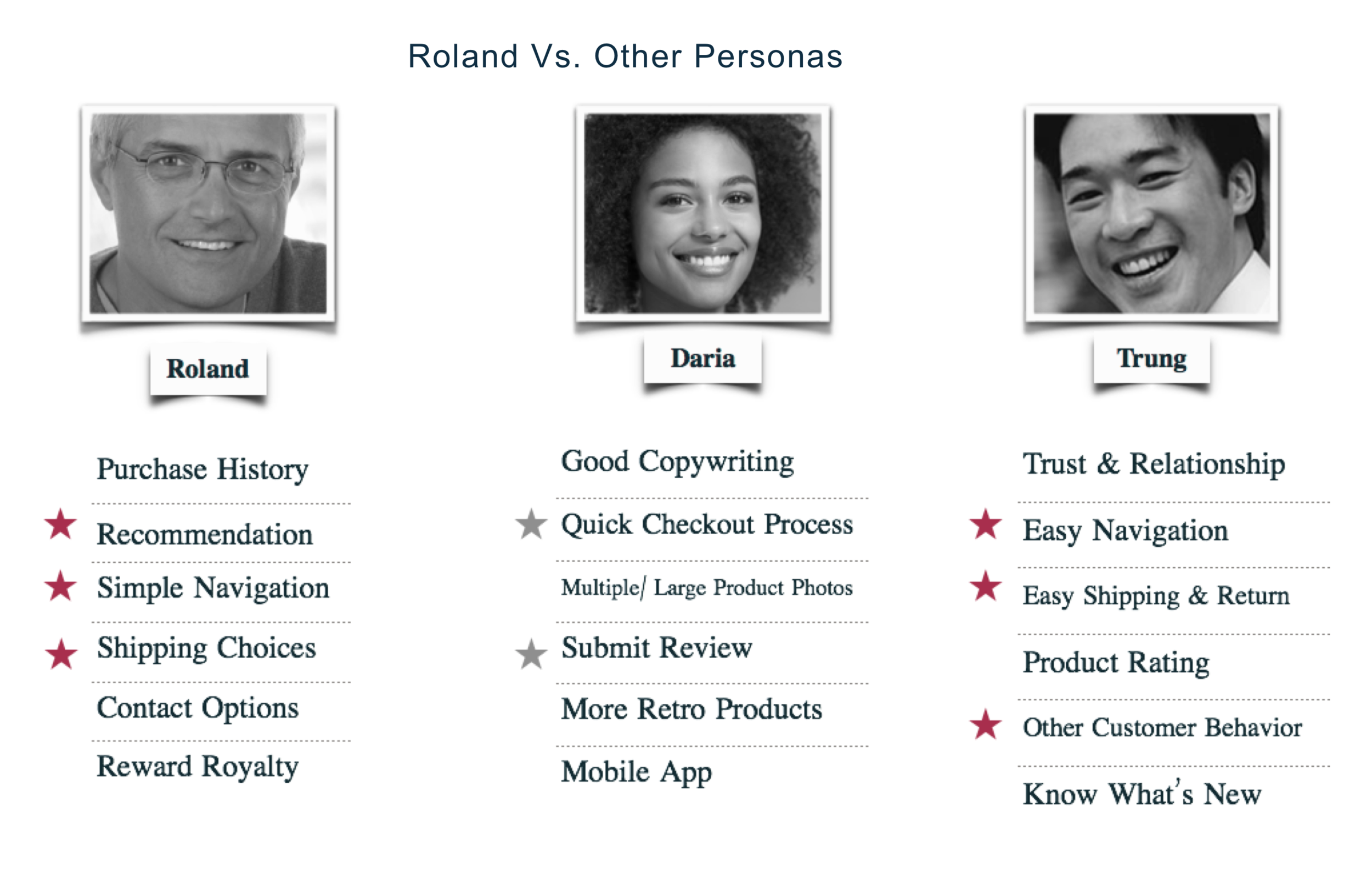
The contextual research shows that older customers are the target audience for the Met store. Moreover, those who are looking for quality, uniqueness of products and recommendation should be the main users. Based on these criteria, Roland was chosen to be the primary persona and Trung was the secondary one because of his similar needs.
User Flow
As shown below, Roland can easily buy a creative present for his granddaughter. He can either starts from the navigation bar and select the Kids section and then the Creativity page or go to his account and click Recommendation. As a loyal customer, the site would have his purchase history and know his preferences.

The Met design highlights
Design Highlights
The Met design highlights
Design Highlights
Before starting the design process, I had a checklist to ensure that all the important things I've learnt from the research would reflect on my work.
Wireflow
The Highlights
Besides reorganizing the global navigation and sorting categories (shown on the sitemap section), there are also some important design solutions worth to mention.
1. Use carousel to prioritize specific contents
Home Page
Although the Sculpture and Jewelry & Watch sections have been removed from global navigation, they might be beneficial for sales during holiday season. So I also put them as hero images on the home page.
2. Create customized features
For Roland's needs, recommendation and purchase history have been created on the home page. More generally, users can either scroll down to find these sections or hover on My Account on the global navigation, where they can also find their browsing history, wishlist and shipping status.
3. Provide delivery options and quick checkout
4. Option to call customer service
Once the users place the order, they will see the Thank You page. If they change their mind, they can click the hyperlink to call customer service right away. Alternatively they can review and/or edit their purchase.
Prototype
The prototype below will demonstrate how my primary persona (a 60-year-old man) could get through when he is trying to buy a gift for his granddaughter and considering one for his grandson.


